Light color, although often overlooked, has a major impact on how we perceive space, colors, and the overall atmosphere of an interior. It also affects our mood, concentration, and daily rhythm. Properly selected lighting is not only a matter of aesthetics, but also everyday comfort.
What is light color?
Light color, also called color temperature, is measured in kelvins (K). It indicates whether light has a warmer, yellowish tone or a cooler, bluish one. Although it sounds technical, its effect is very intuitive:
- 2200–3000 K: warm, atmospheric light, associated with candles and traditional bulbs
- 4000–4500 K: neutral white light, often used in offices and workspaces
- 5000–6500 K: cool, daylight-like light, common in studio lighting
The higher the Kelvin value, the cooler the light appears.
Why does light color matter so much?
Impact on mood
Warm light promotes relaxation and calmness, which is why it is commonly used in living rooms, bedrooms, and restaurants. Cooler tones stimulate alertness and support concentration, making them suitable for workplaces.
Perception of space and colors
Lighting directly affects how we see wall colors, furniture, and accessories. The same color can look completely different depending on the light’s color temperature.
Health and daily rhythm
Cool light in the evening can disturb falling asleep because it resembles daylight and reduces melatonin production. Using warmer light after dark supports the body’s natural relaxation process.
Use in photography and displays
Color temperature determines whether an image appears warmer or cooler. In photography and product presentation, proper white balance helps maintain natural-looking colors.
How to choose light color for each room?
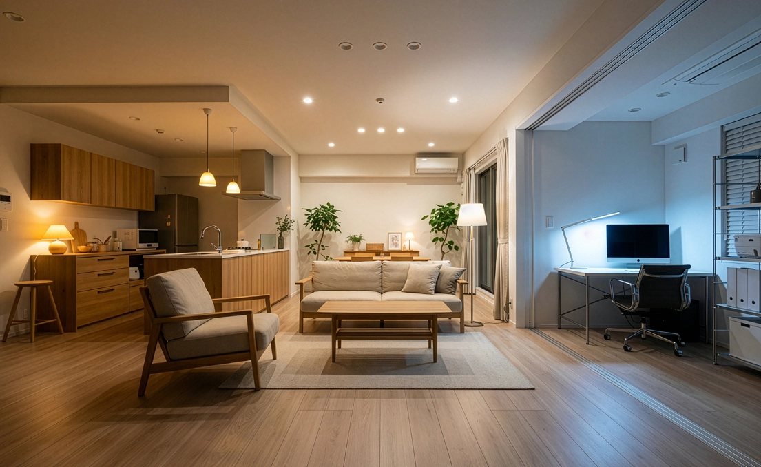
Living room
Warm light in the 2700–3000 K range creates a cozy atmosphere. It works well when combined with spot lighting at a slightly higher color temperature.
Kitchen
Neutral light at 3500–4000 K shows food colors accurately and provides comfort during meal preparation.
Bathroom
Neutral or slightly cool light at 4000–5000 K makes everyday tasks like makeup and shaving easier.
Office and workspace
Cooler light at 5000–6500 K supports focus and reduces feelings of tiredness.
CRI: color rendering quality
In addition to color temperature, it is worth paying attention to the CRI (Color Rendering Index), which shows how accurately light reproduces colors:
- CRI 80: standard applications
- CRI 90+: very good color rendering, recommended for kitchens, bathrooms, and product displays
The higher the CRI value, the more natural colors appear.
Choosing light color consciously in interior design
Light color is more than just a technical parameter. It is a tool that directly affects living comfort, interior functionality, and visual perception. By choosing lighting consciously, you can create a space that supports relaxation, work, or social gatherings.
Discover lighting tailored to your needs
At furnika.pl, you will find lighting solutions that combine aesthetics with functionality. Choose a light color that matches your interior’s character and enjoy a space designed for everyday comfort.